
The delightful Bob McDavitt of NZ's Met Service clarifies a few things for me via his blog:
 |
| Bob McDavitt's illustration |
- Mugginess has it's upsides. Pohutakawa trees enjoy it and flower more.
- Humidity is not a good metric for mugginess. 100% humidity tells us that the air is holding as much water as it can (it's saturated), but the actual amount of water this is depends on factors like temperature and pressure. In fact, the 100% humidity we're now enjoying in Auckland is also experienced from time to time in Dunedin, at the bottom of the South Island, but doesn't feel half so bad there.
- "The air feels muggy when we get hot and sticky – and that’s when 1) the air is warm enough to make us perspire, and 2) the air contains sufficient water vapour to interfere with the evaporation of our perspiration and not allow us to cool down much from that. So mugginess depends on both heat and humidity."
All this gave me two ideas.
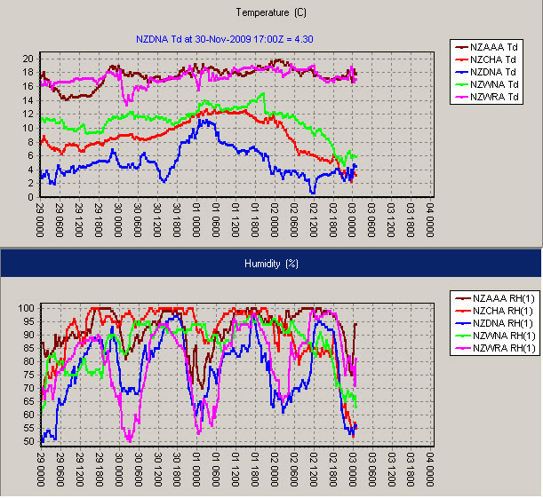
- Wouldn't it be nice to demonstrate the "mugginess point" via a scatterplot of temperature and humidity rather than Bob's slightly crummy charts (sorry Bob)?
- This time series dataset is a perfect opportunity for me to try out Google Docs' motion chart gadget - a freely available bubble chart which is animated over time.
What I came up with is nice. Not perfect yet (for explaining mugginess at least!) but kinda fun and a good first step on my road to animated charts.
Note: press play at the bottom to see the time series. The speed gauge is immediately to the right of the play button. Dates are in US format. Dew point is colour, and the two series are Auckland (right) and Wellington (left). Have a play.
No comments:
Post a Comment