
The interesting thing is that it's changing.
The Pew Research Center asks people every year, "How do you get most of your news about national and international issues?" The latest release shows that for some demographics at least, internet news is at least as important as TV. Even overall, it's not looking good for traditional media.
The solid line here is a trendline (statistically significant regression) of the actual data points. Data were collected at uneven intervals, so I've taken that into account in my visualisation.
You'll also notice some coloured crosses - these relate to news sources for specific events. Pew asked people "How do you get most of your news about the war in Iraq / Hurricane Katrina / the terrorist attacks (9/11)?" We could argue that people's recall of their main news source is likely to be more accurate when linked to a specific past behaviour, such as following a particular story in the news, rather than news consumption in general. Interestingly, TV news is relatively more important, and other sources are relatively less so, when asked about these specific events. It would be interesting to see this kind of measure for the current decade.

The effect you see in the chart of internet news gobbling up newspaper readership and to a lesser degree TV viewing is amplified for younger groups, as can be seen on P3 of the original report.
As you might expect, there's also a socio-economic trend in the data: richer, more educated people are less likely to consider TV news and more likely to consider internet news as a main source. When we remember that people were prompted to give up to two sources, this is fairly damning for TV news broadcasters.
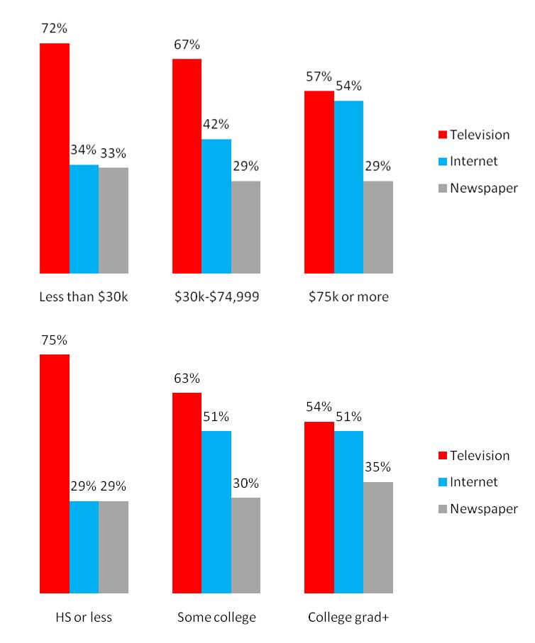 |
| Source: PEW RESEARCH CENTER. Figures add to more than 100% because respondents could volunteer up to two main sources. |
 |
| Source: PEW RESEARCH CENTER. Figures add to more than 100% because respondents could volunteer up to two main sources. |
PS Word of warning to anyone who likes coxcomb (polar area) charts as much as I do: sometimes they just don't work so well... Doh!

No comments:
Post a Comment